
Upcoming Data Visualization Tools in 2024
What is Data visualization?
Data visualization tools
Learning Data Visualization Tools to Further Your Career
FAQ's
As we move into the next era of data-informed decision making, the entire field of visualizing information is poised for a revolutionary evolution. With so many things changing fast all of the time, it is no longer enough to use old-fashioned visualization techniques. New technologies, including artificial intelligence, machine learning and augmented reality are leading us toward a new era of real-time visualization tools.
In this article, we trace out the journey of data visualization and highlight some forecasts for 2024. It examines the crucial abilities of AI and ML to facilitate automated analysis, the rise of real-time visualization, that immersive techniques have come for a moment in time before disappearing again into nothingness, and how tools so ordinary people can use them easily are essential.
What is Data visualization?
Data visualization is the presentation of data in visual formats like charts and graphs to make complex information easily understandable. Its goal is to help individuals interpret patterns, trends, and insights within datasets, aiding informed decision-making. Widely used across fields such as business and science, data visualization enhances accessibility and engagement. It includes various formats such as bar charts, line graphs, and interactive dashboards, selected based on data characteristics and desired insights. Effective data visualization is crucial for conveying information concisely and engagingly, facilitating a better understanding of the underlying data.
Data visualization tools
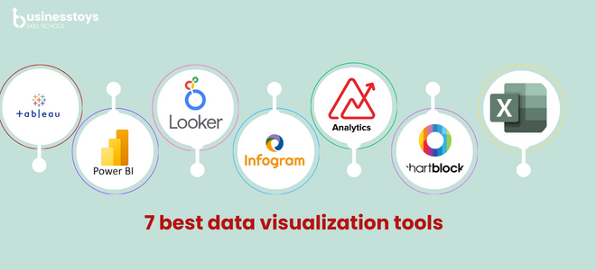
Tableau: Tableau is a powerful data visualization and business intelligence platform that enables users to create interactive and shareable dashboards. It connects to various data sources, transforming raw data into visually compelling insights. Tableau's user-friendly interface makes it accessible for individuals and organizations to analyze and understand their data effectively.
Microsoft Power BI: Microsoft Power BI is a business analytics tool that transforms raw data into insightful visualizations and interactive reports. It enables users to connect to various data sources, create compelling dashboards, and share information across organizations, facilitating data-driven decision-making and enhancing business intelligence capabilities.
Looker: With Google's Looker, business users may create dashboards and reports from a variety of data sources, enabling real-time insights into processes and embedded applications. Looker is Google's unified self-service analytics platform. Its interface with Google Cloud Platform fosters sophisticated analytics solutions by improving data processing capabilities using BigQuery ML, AutoML, and Vertex AI.
Infogram: It allows users to transform raw data into visually appealing charts, graphs, and infographics. With an intuitive drag-and-drop interface, Infogram simplifies the process of creating engaging visual representations of data, making it accessible to users without extensive design or coding skills. It's widely used in various fields, including business, education, and journalism, to communicate information effectively through compelling visuals.
Zoho Analytics: Zoho Analytics stands out as a robust business intelligence, online reporting, and data visualization tool, enabling the swift creation of attractive data visualizations and informative dashboards. With its cloud-based platform, Zoho Analytics efficiently manages extensive datasets and offers diverse reporting choices, catering to the needs of businesses across various sizes.
ChartBlocks: Creating personalized data visualizations is simple with ChartBlocks, an intuitive online tool that lets users make charts without knowing any programming. Using and sharing charts on websites and social media platforms is made easier with this tool. ChartBlocks uses D3.js to generate responsive visualizations that are SVG files of excellent quality that work on a range of screen sizes.
Google Charts: Google Charts is a robust data visualization tool that transforms user-supplied information into graphical charts. By utilizing JavaScript embedded in web pages, users define formatting preferences, and the service generates chart images. It enhances data accessibility, making it actionable for decision-makers and the general audience.
Chatbots: Chatbots improve data visualization by giving users a conversational interface through which to engage with the data that is shown. By using natural language, users may ask questions about certain data points, get real-time updates, or look for insights, making the experience more approachable and engaging. This makes it easier to comprehend and make decisions based on the info that is offered.
Microsoft Excel: Microsoft Excel is a powerful tool for data visualization, offering a range of charts, graphs, and formatting options. With features like pivot tables and conditional formatting, Excel enables users to easily interpret and communicate data trends, making it an essential tool for creating visually compelling and informative presentations.
Learning Data Visualization Tools to Further Your Career
The demand for business analysts in the IT sector is on the rise, creating a substantial skills gap as organizations struggle to fill essential roles. This scarcity of qualified professionals presents a valuable opportunity for individuals aspiring to become business analysts. By acquiring proficiency in data visualization tools through Businesstoys ,aspiring analysts can improve their skill sets and increase their likelihood of securing coveted positions in their chosen career paths.
FAQ's
Data visualization is the graphical representation of information and data, utilizing charts, graphs, and maps to help people understand patterns, trends, and insights more effectively. It is crucial for facilitating better decision-making and communication of complex information.
Infogram serves as a tool to transform raw data into visually appealing charts, graphs, and infographics. With its intuitive drag-and-drop interface, it simplifies the process of creating engaging visual representations of data, making it accessible to users without extensive design or coding skills.
Yes, there are numerous tools available. Some popular ones include Tableau, Microsoft Power BI, Google Data Studio, D3.js (for web-based visualizations), and Python libraries like Matplotlib and Seaborn.
Data visualization tools play a crucial role in changing audience interaction with information. By providing dynamic and interactive visualizations, these tools make data more engaging and comprehensible, thereby improving the way information is shared and understood across various industries and sectors.
Yes, many tools support real-time data visualization, allowing users to monitor and analyze data as it's generated. This is especially valuable in dynamic environments like financial markets or online platforms.
Leave a comment
Your email address will not be published. Required fields are marked with *